
在場FACTORY
Brand Visual Identity
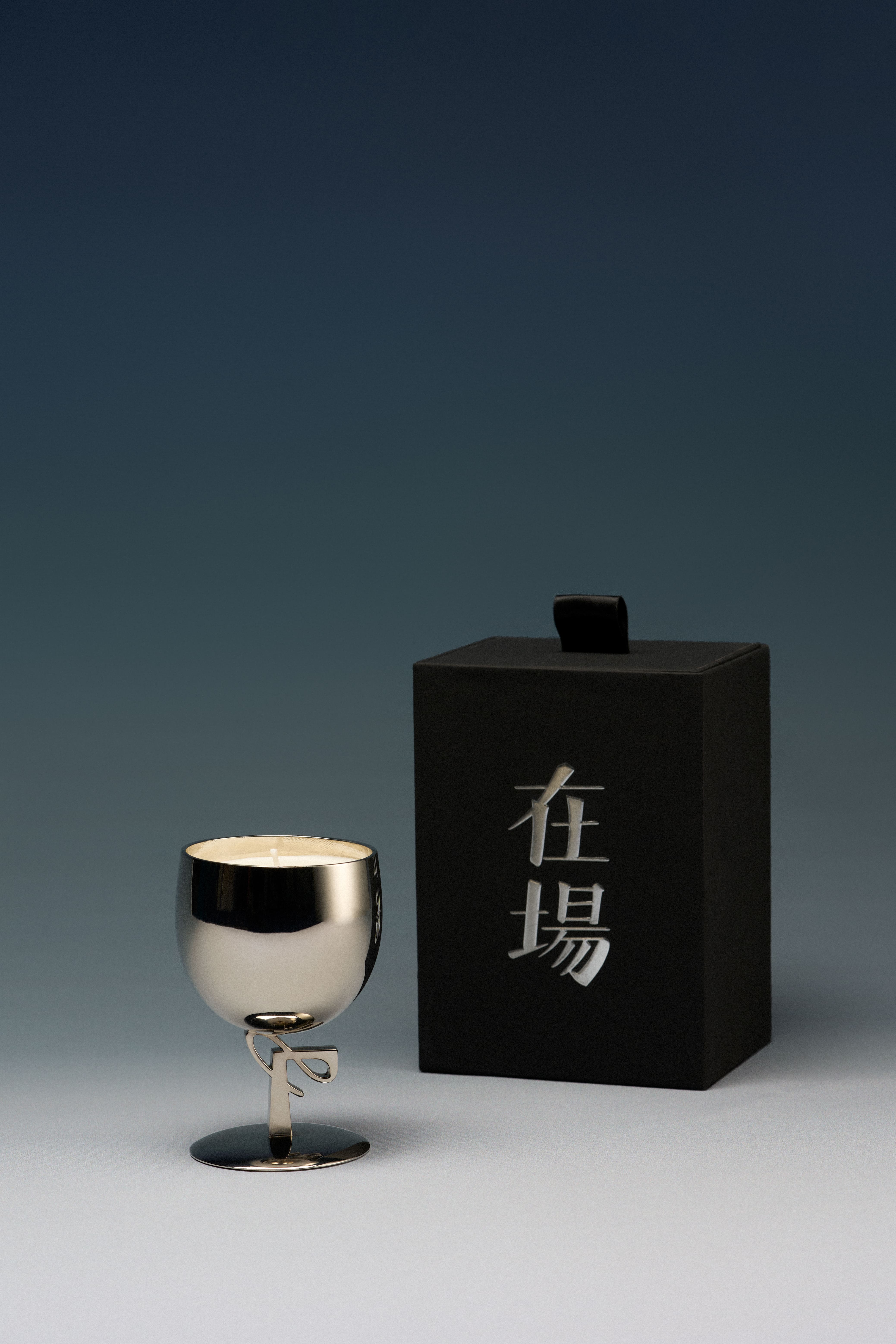
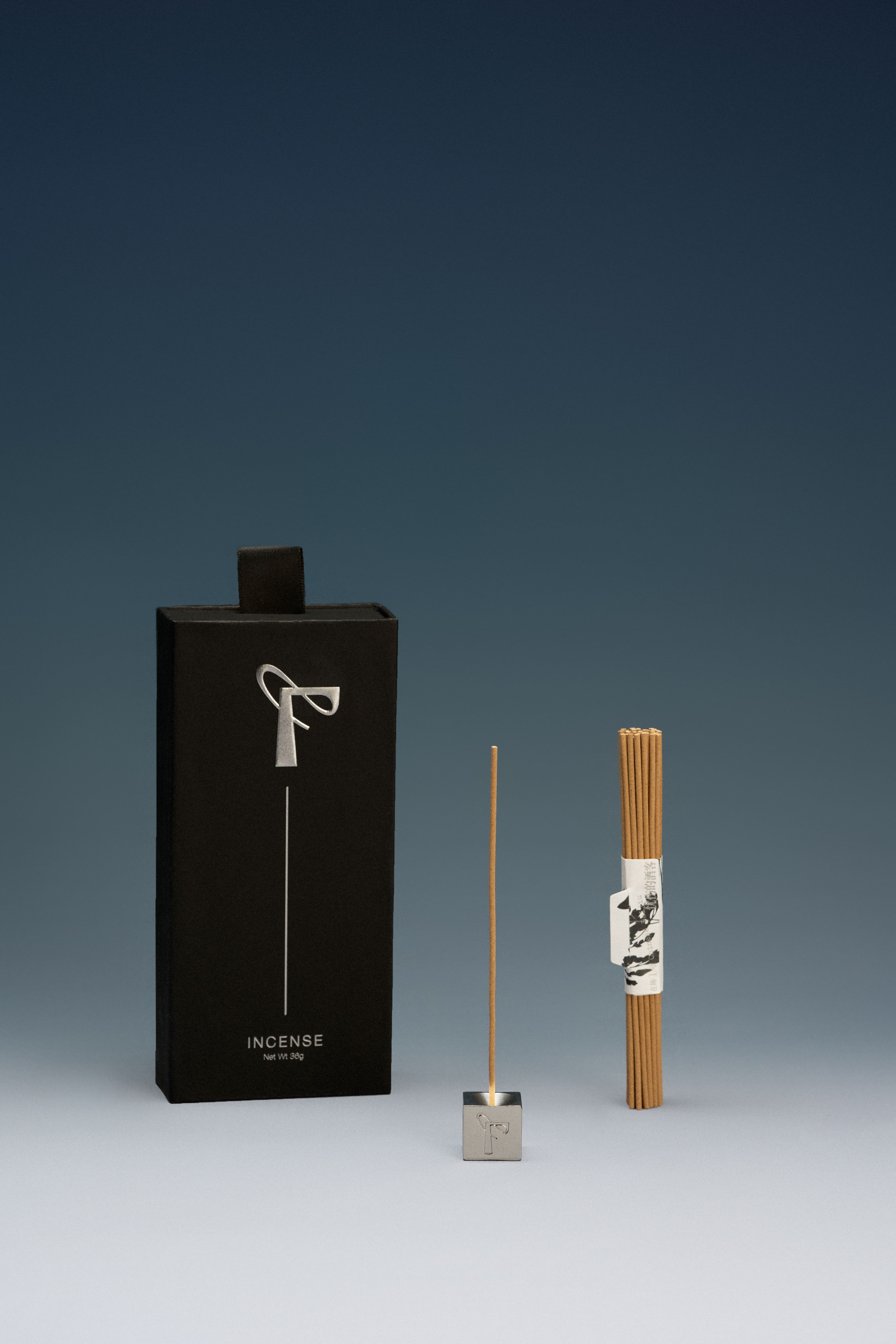
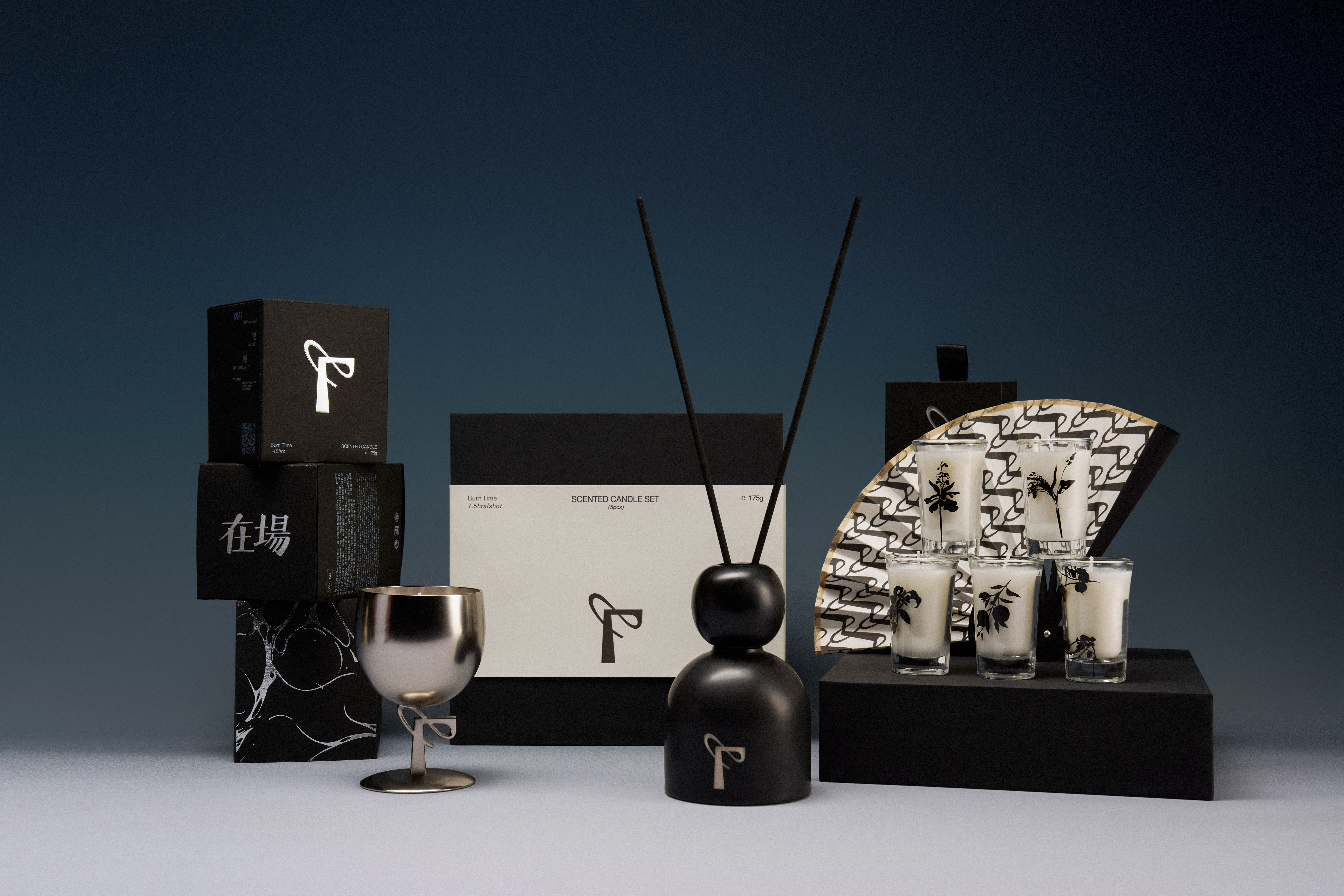
「在場FACTORY」不同于大多数香氛品牌,是香的一线制造者,本身拥有制香工厂。日常与调香师、手工制造者、原料产地农民为伍,真实、温暖的实用主义是品牌底色。
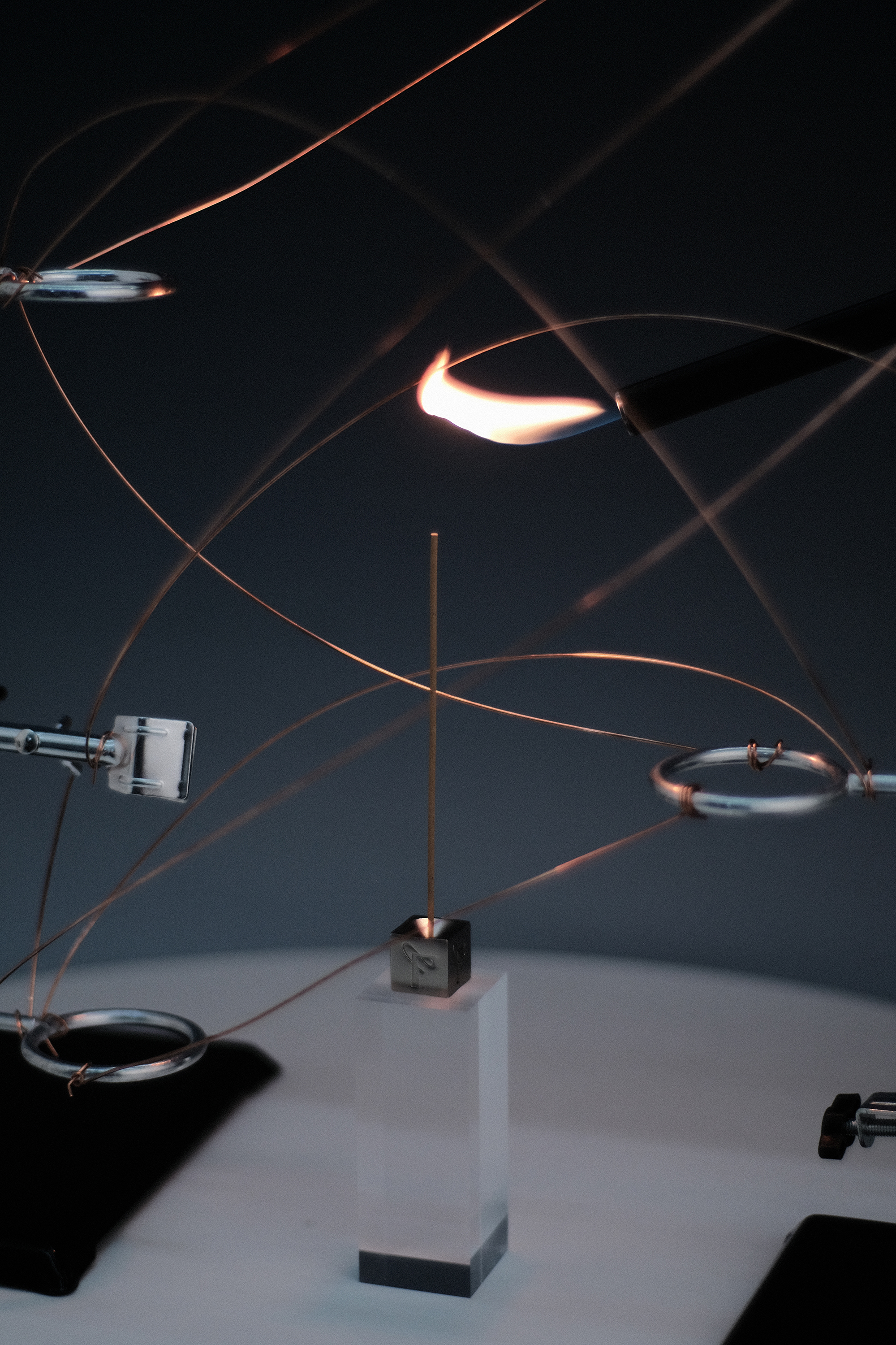
「在場FACTORY」相信“在场性(Anwesenheit)”,即直面事物的力量。遵循自然造香,尊重制香者的知觉与创造,以香为媒介开启“自然的实用主义”的生活思潮。同时相信气味能把你带回到任一个当下,这便是在场的力量。
「在場FACTORY」相信“在场性(Anwesenheit)”,即直面事物的力量。遵循自然造香,尊重制香者的知觉与创造,以香为媒介开启“自然的实用主义”的生活思潮。同时相信气味能把你带回到任一个当下,这便是在场的力量。
Workteam:
AD: cactuslian
designer: cactuslian & 零钱
photograph: 25號
「FACTORY」 is different from most fragrance brands. It is a first-line manufacturer of fragrances and has its own R&D team. It‘s in the company of perfumers, artisans, and farmers in the origin of raw materials. Sincerity and warm pragmatism is the faith of the brand.
We believes in "Anwesenheit", that is the power to face things head-on. Follow nature to make incense, respect the perception and creation of the incense maker, and use incense as a medium to start the life trend of "natural pragmatism". And believing that smell can bring you back to any present moment,it’s the power of 「FACTORY」.

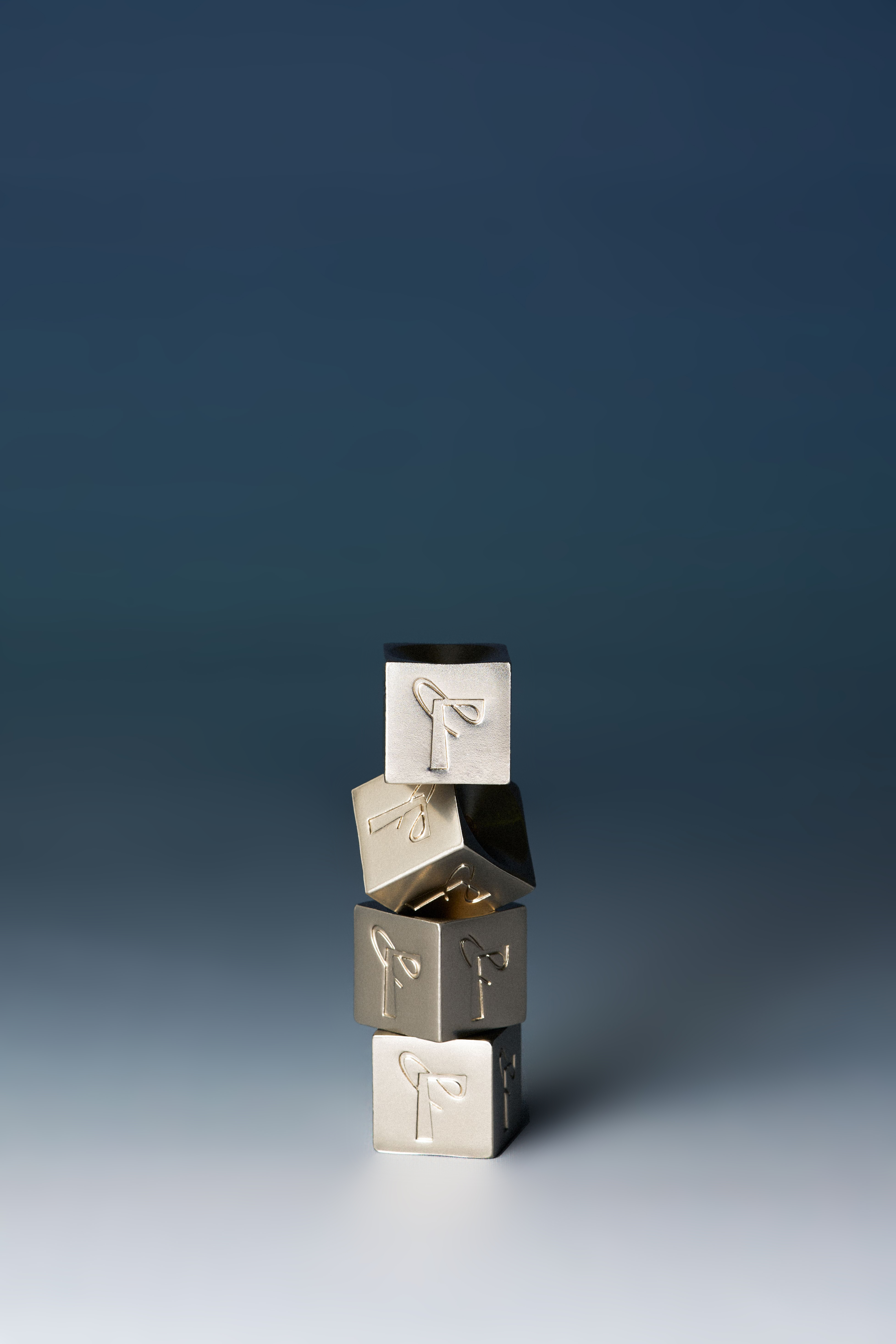
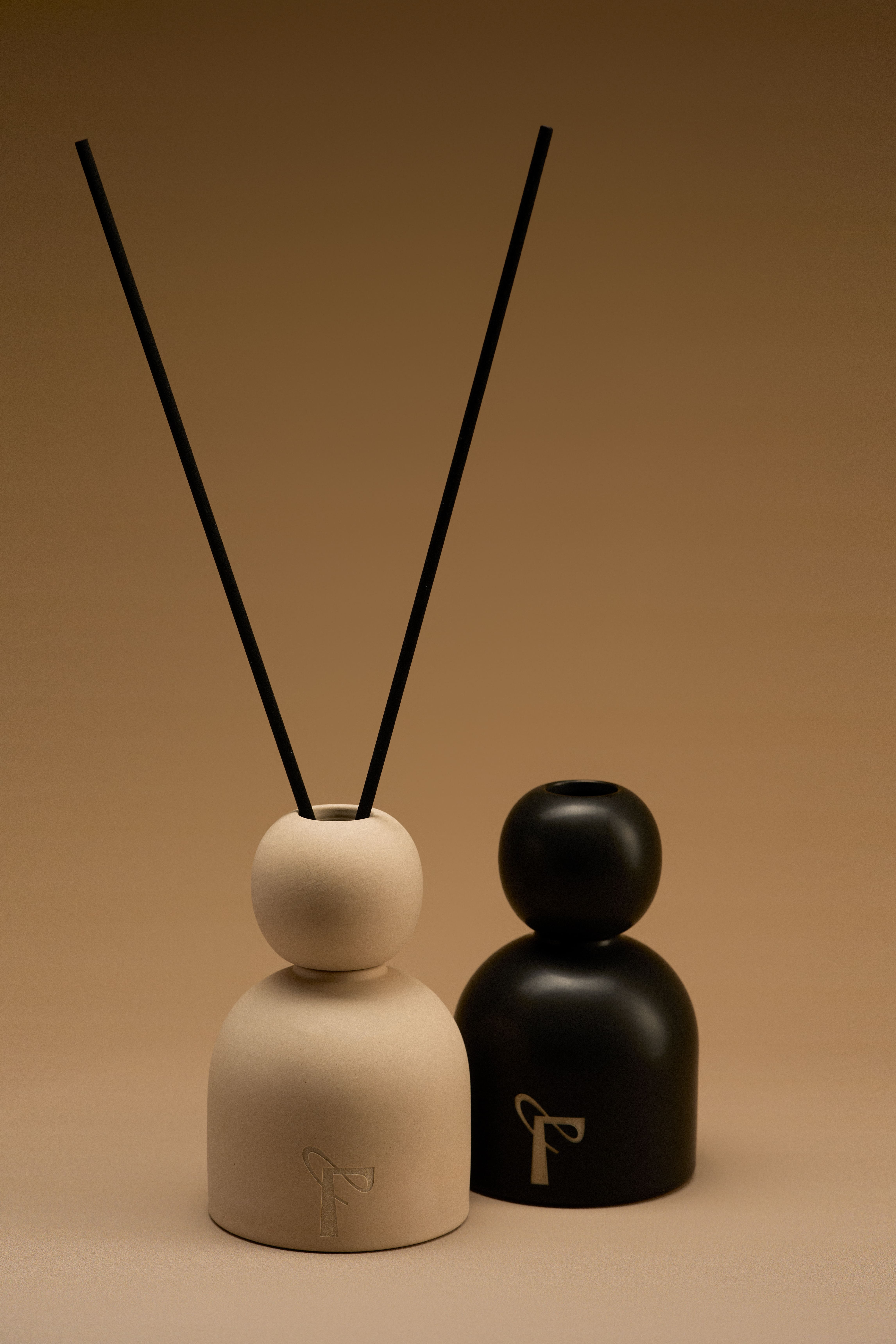
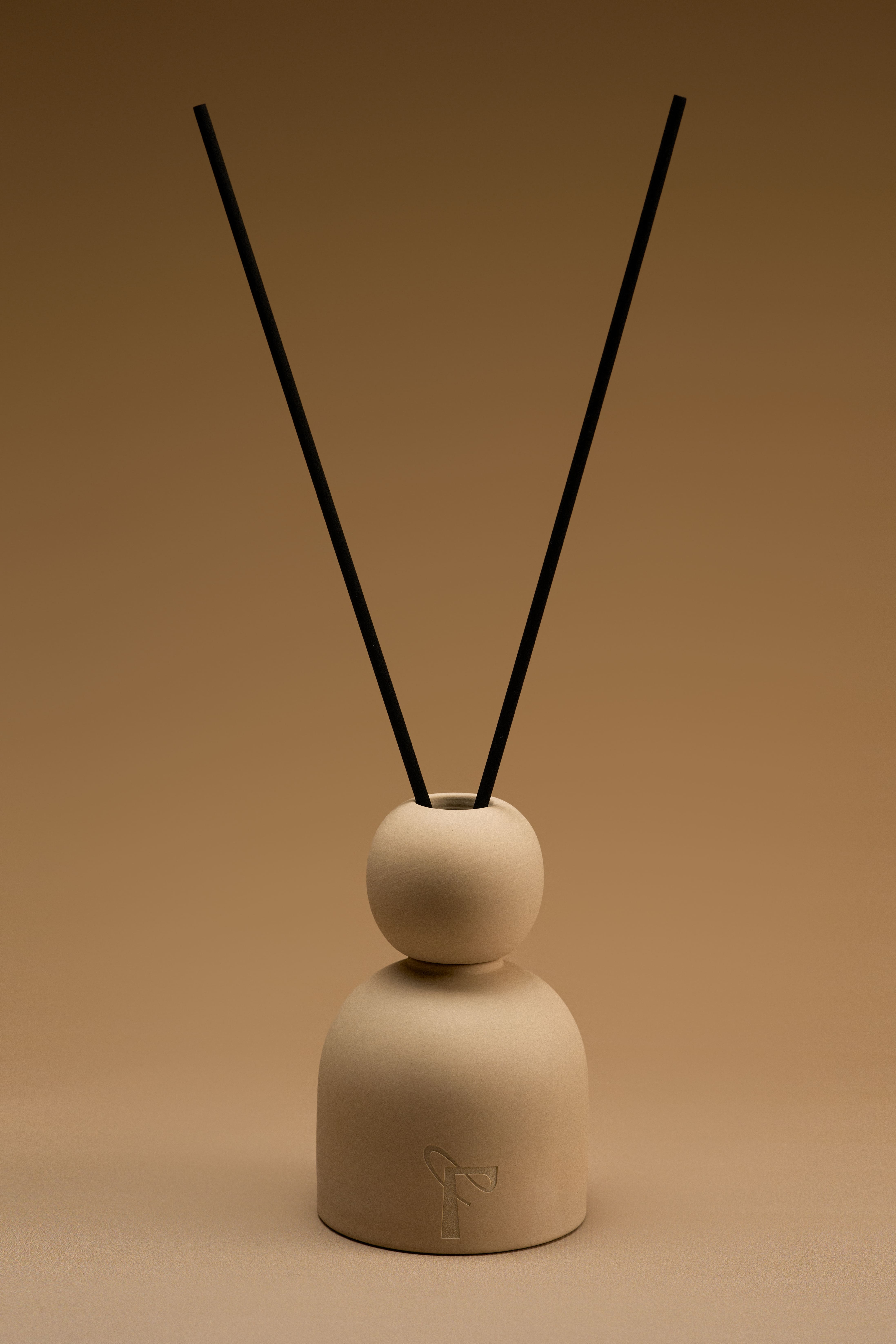
基于「在場FACTORY」自然、实用主义、智性的品牌基因,且本身具有的工厂特色,logo字体选择简洁、张力的笔触,呈现中性气质的品牌性格。图形设计的构思上,从品牌核心元素“FACTORY(厂)”出发,将“厂”与“F”合二为一,笔画上连贯而成,呈现轻盈、自由的可能,图形的形态同时又像字母“P”,代表 “present”,即「在场」。字形上,重心坚韧代表实用主义,柔软飘逸的线条象征着理想主义冒险,整体展现刚柔并济的中性美学。
Based on the brand gene of "nature, pragmatism and Intellectuality" and the characteristics of the factory itself, the logo font was chosen with simple and tense strokes, presenting the brand character of neutral temperament.The concept of graphic design, starting from the brand core element "FACTORY”, combining "factory" and "F" into one, with a coherent stroke, presenting lightness and freedom.The figure also resembles the letter "P", which stands for "Present”In glyphs, the center of gravity represents pragmatism, while the soft and flowing lines symbolize idealistic adventure, showing the overall unisex aesthetics of both rigidity and flexibility.