
阿卡普AKAPU
· Brand visual identity·
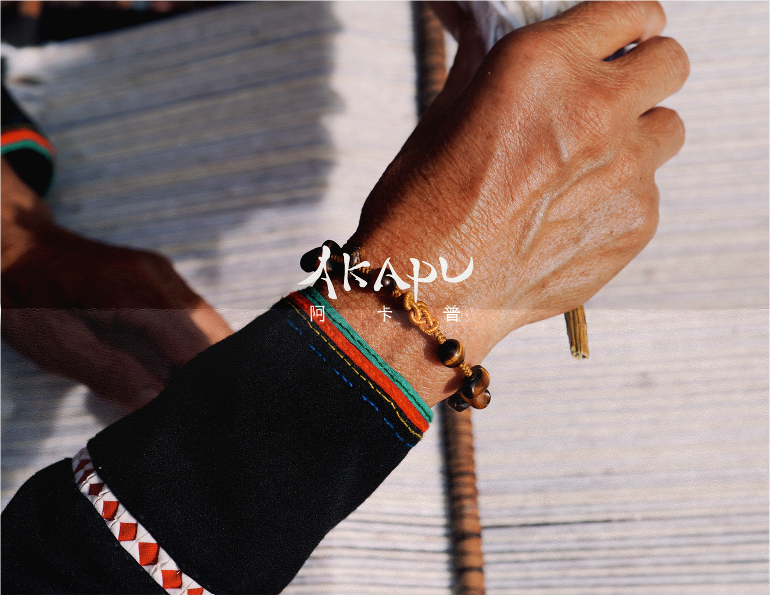
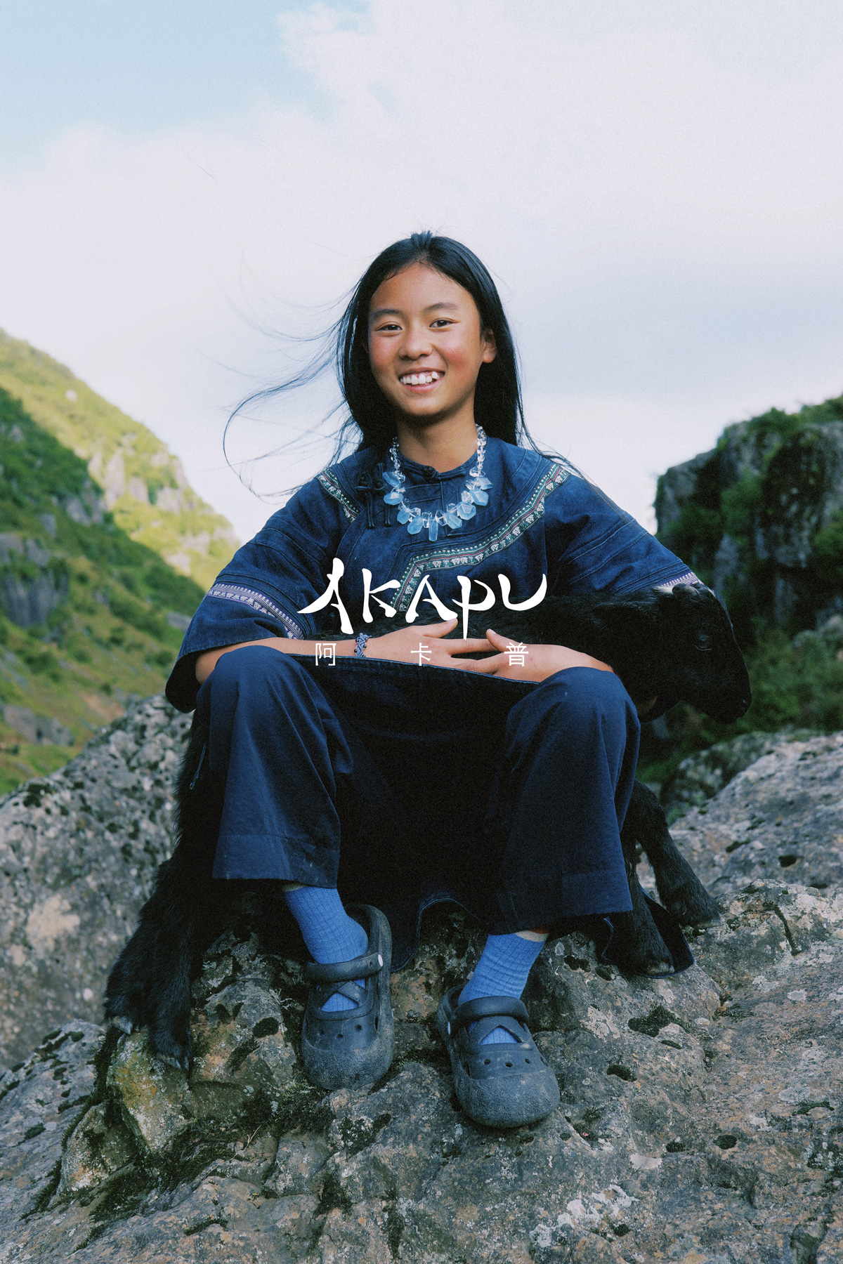
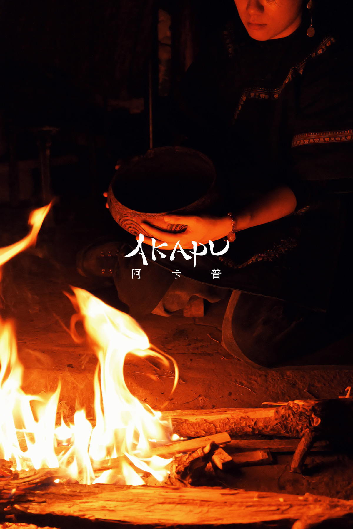
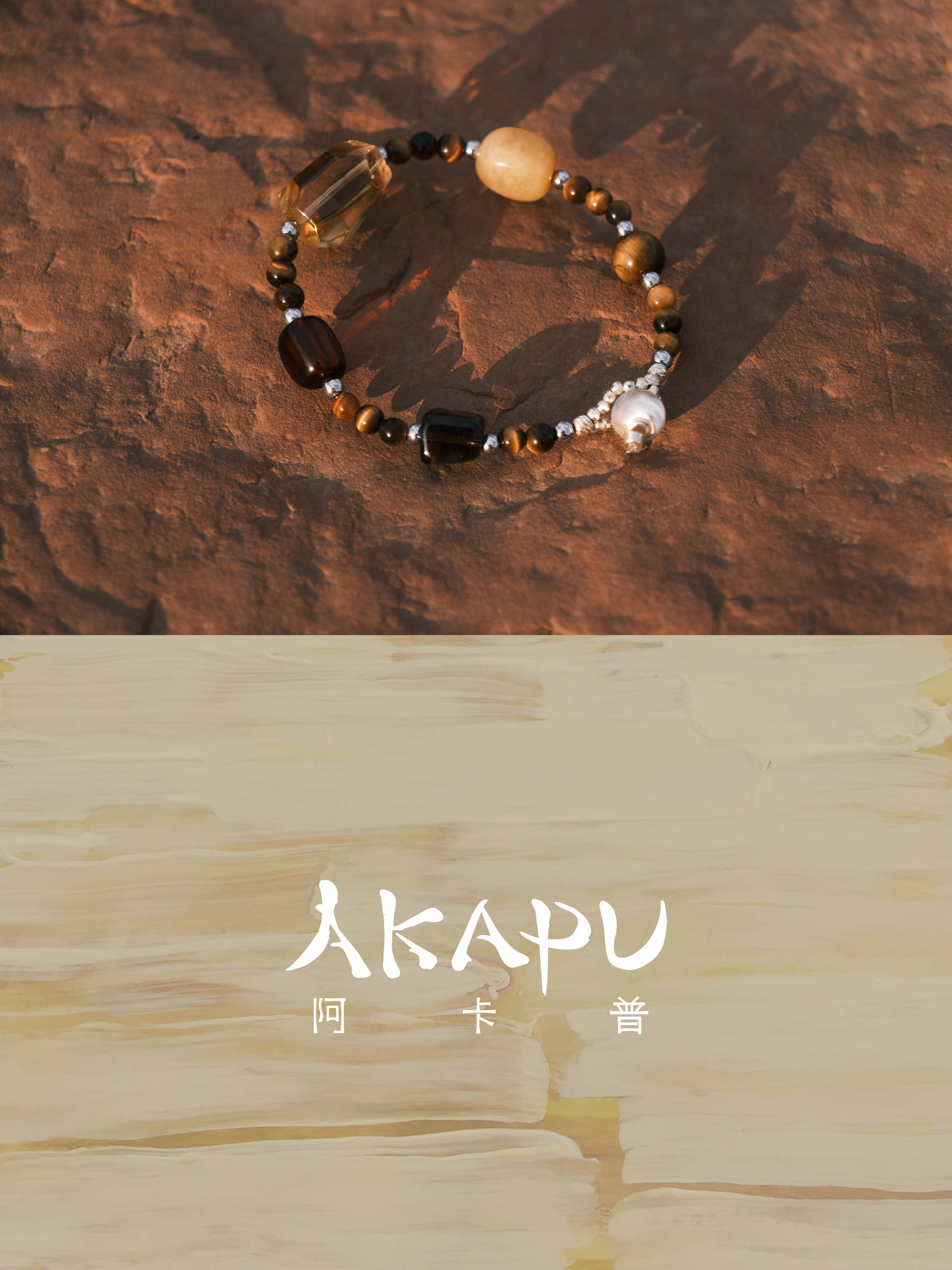
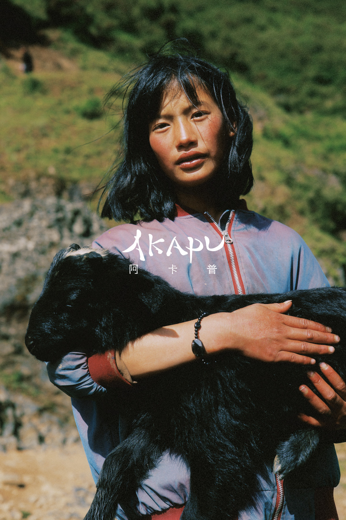
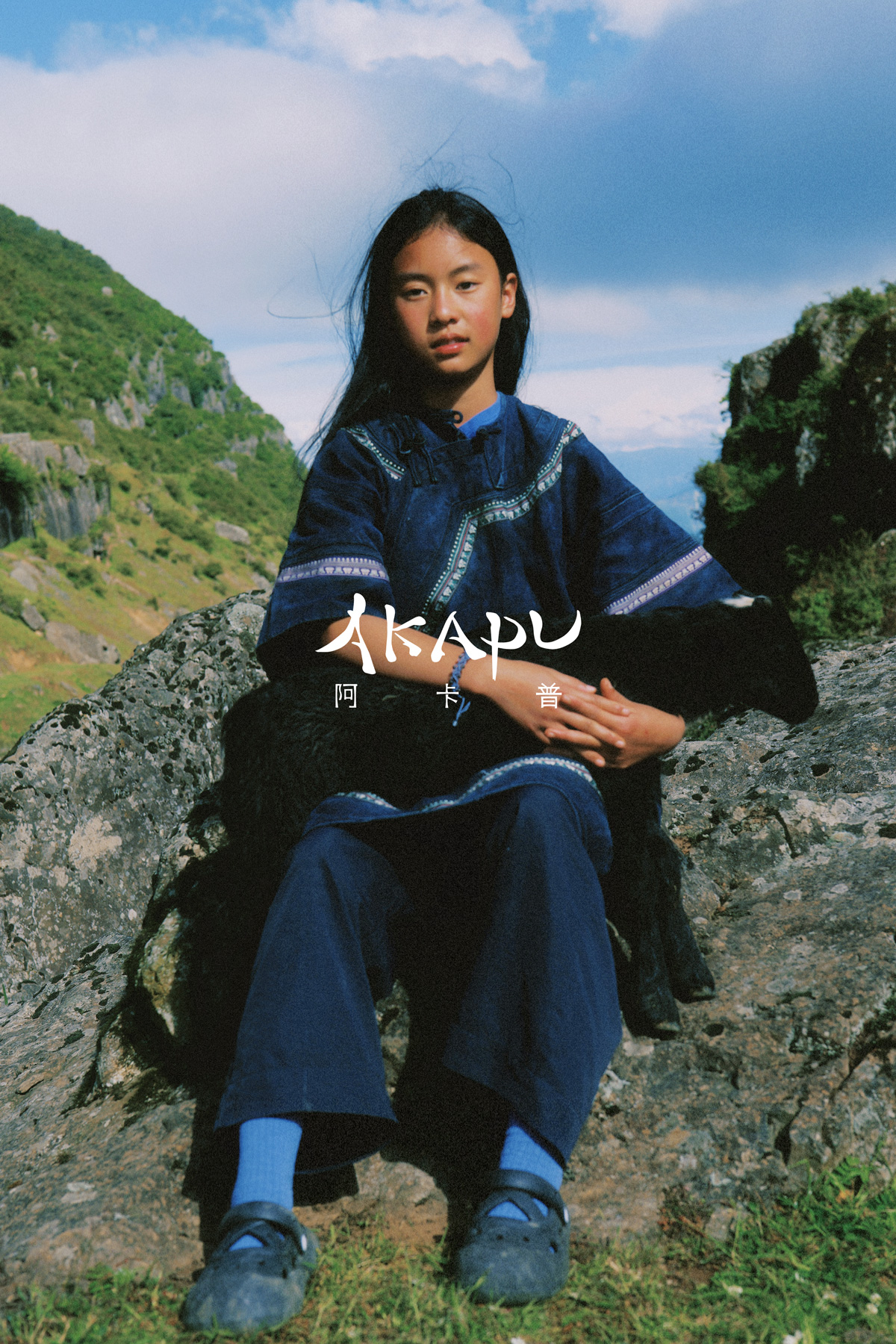
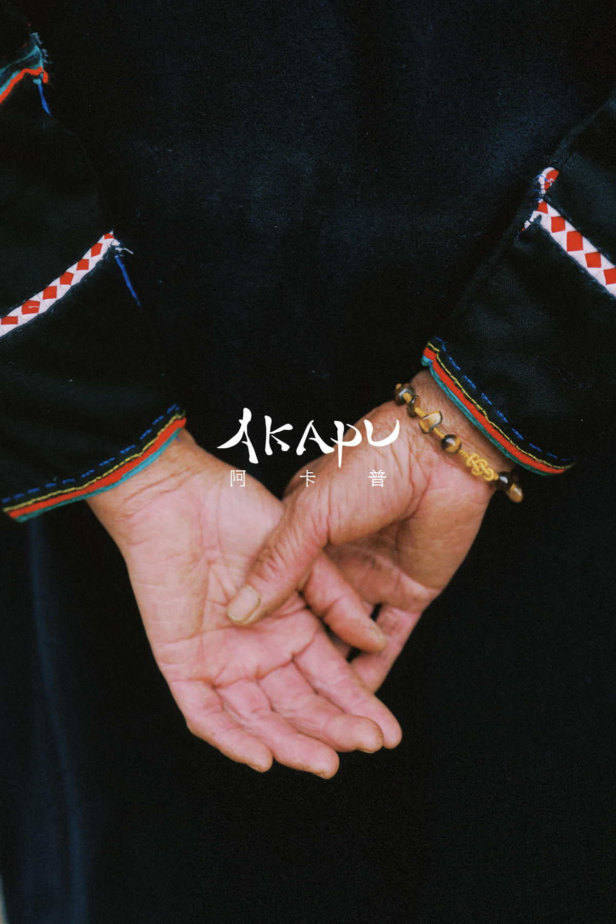
“Akapu”意为“我与花”,是人与自然共生的隐喻。通过探寻中国这片土地上的古老智慧,将大地的馈赠转化为可持续佩戴的手势,唤醒佩戴者与自然能量的原始连接。
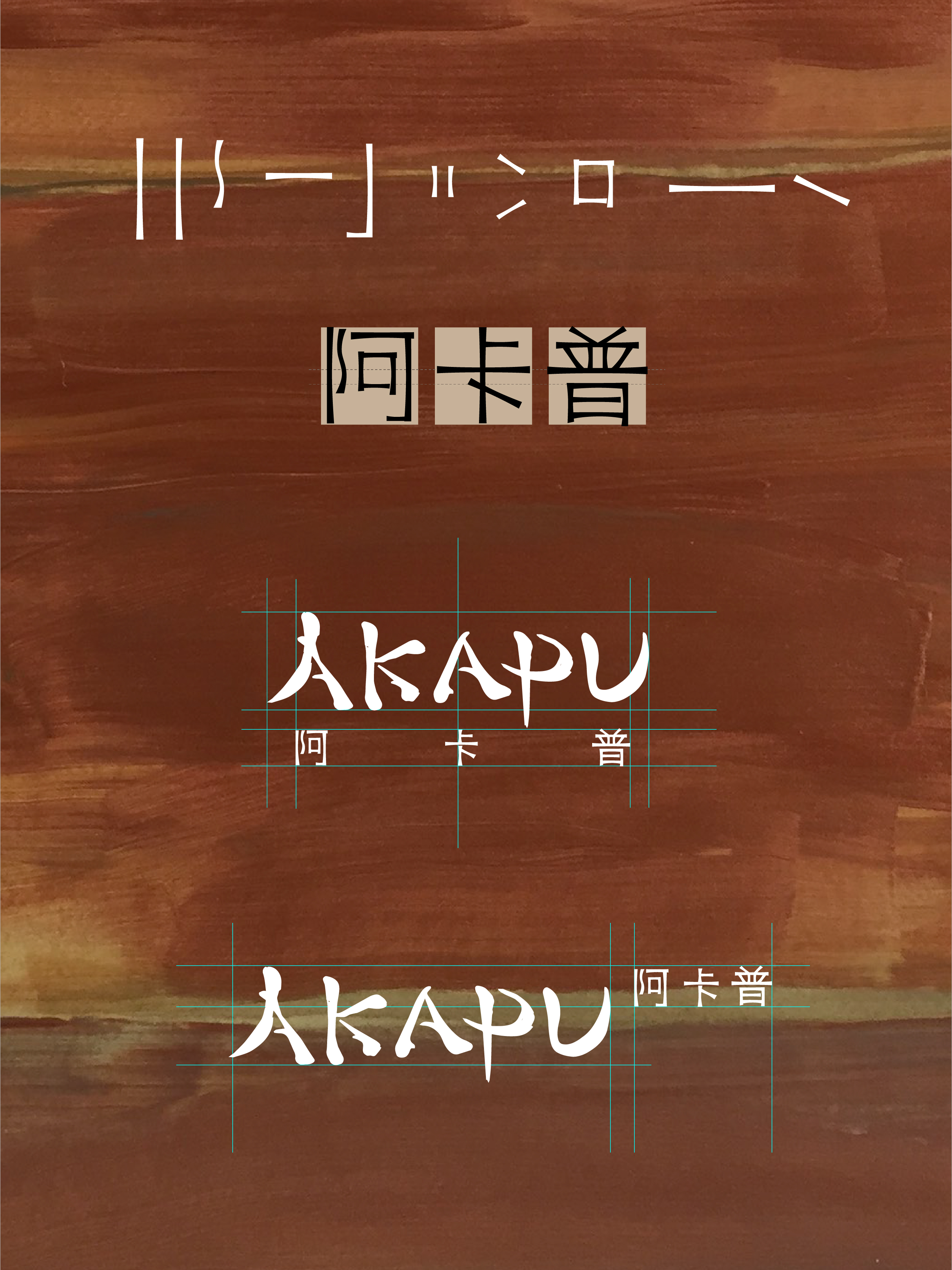
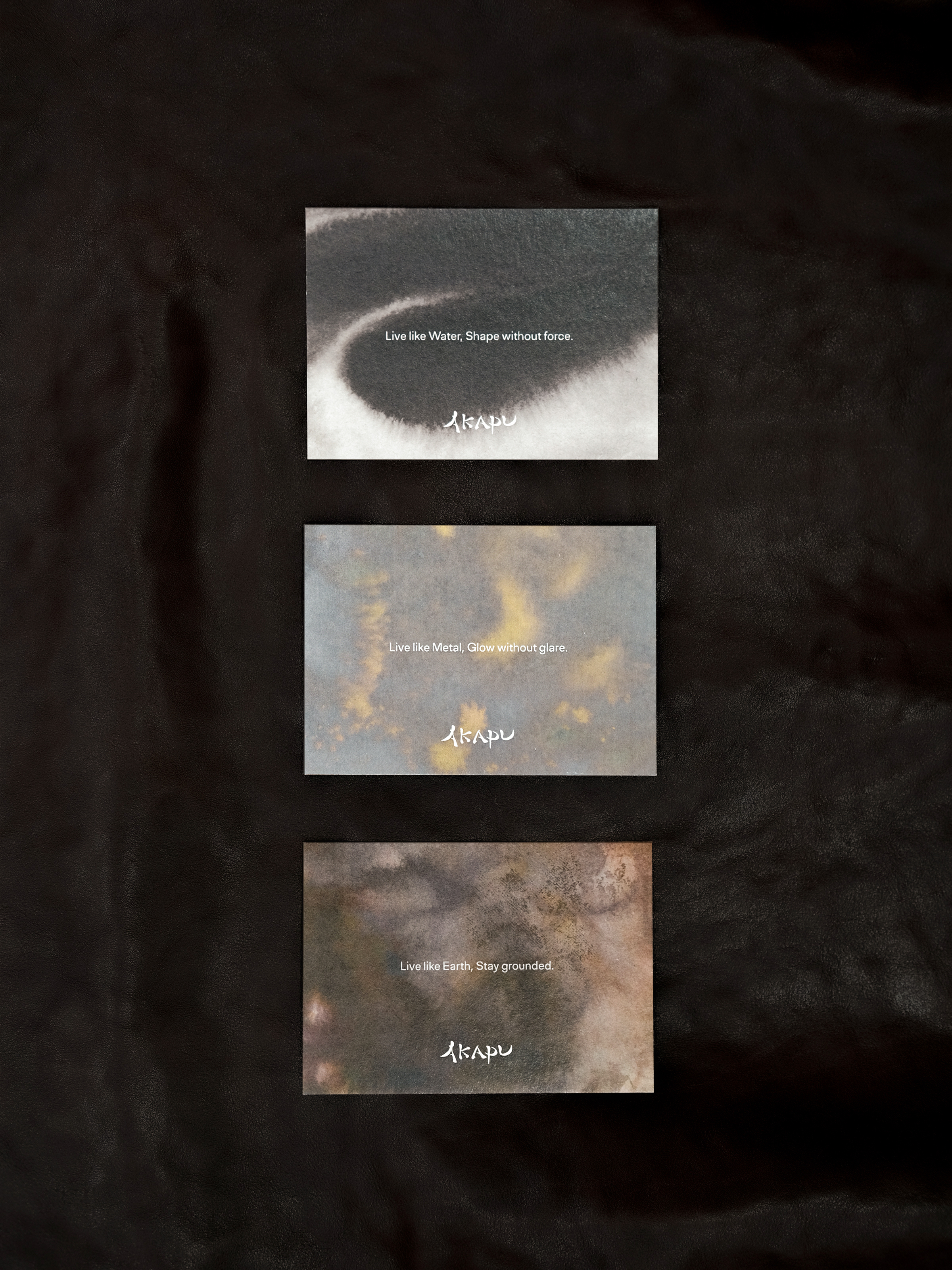
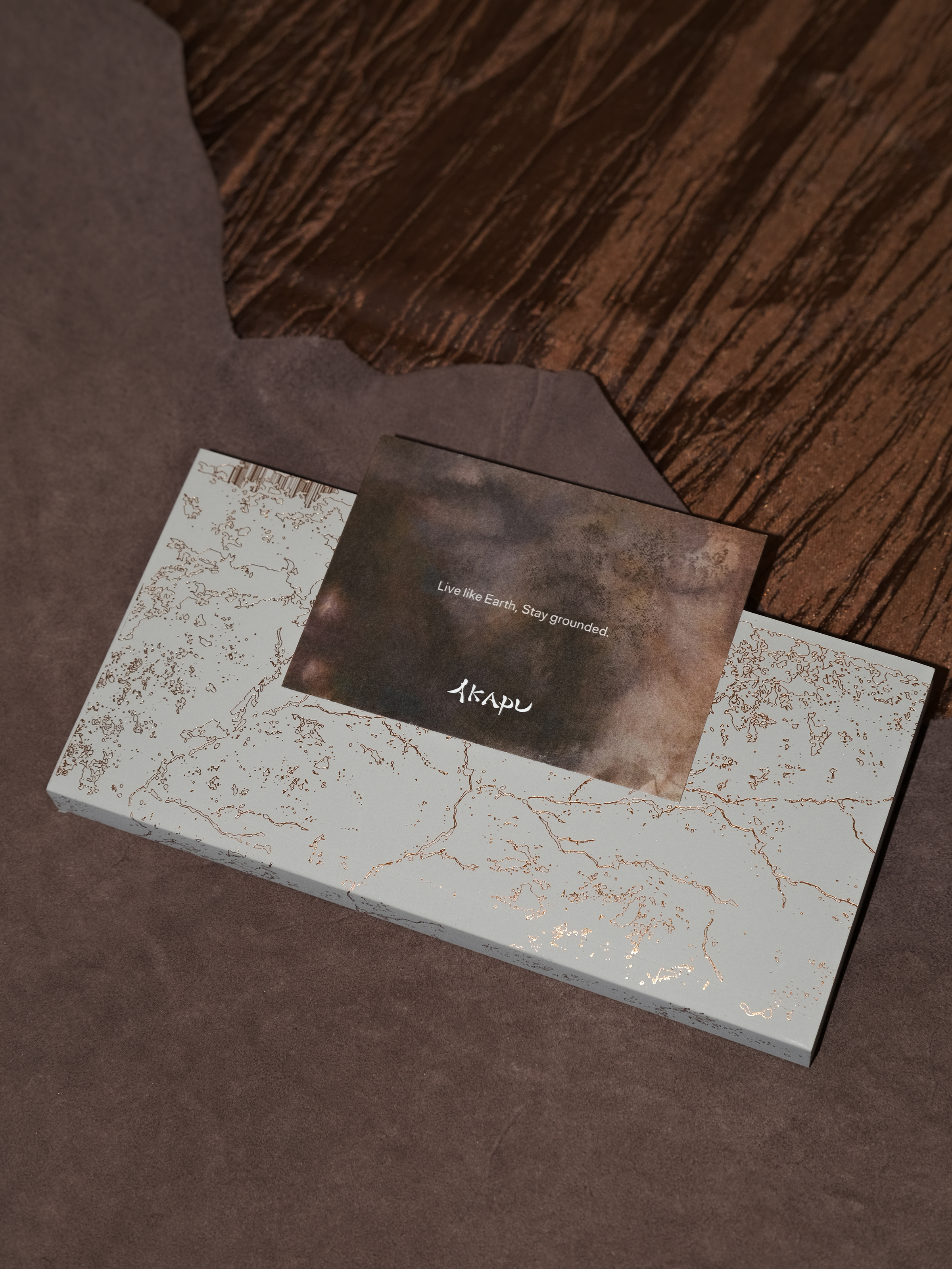
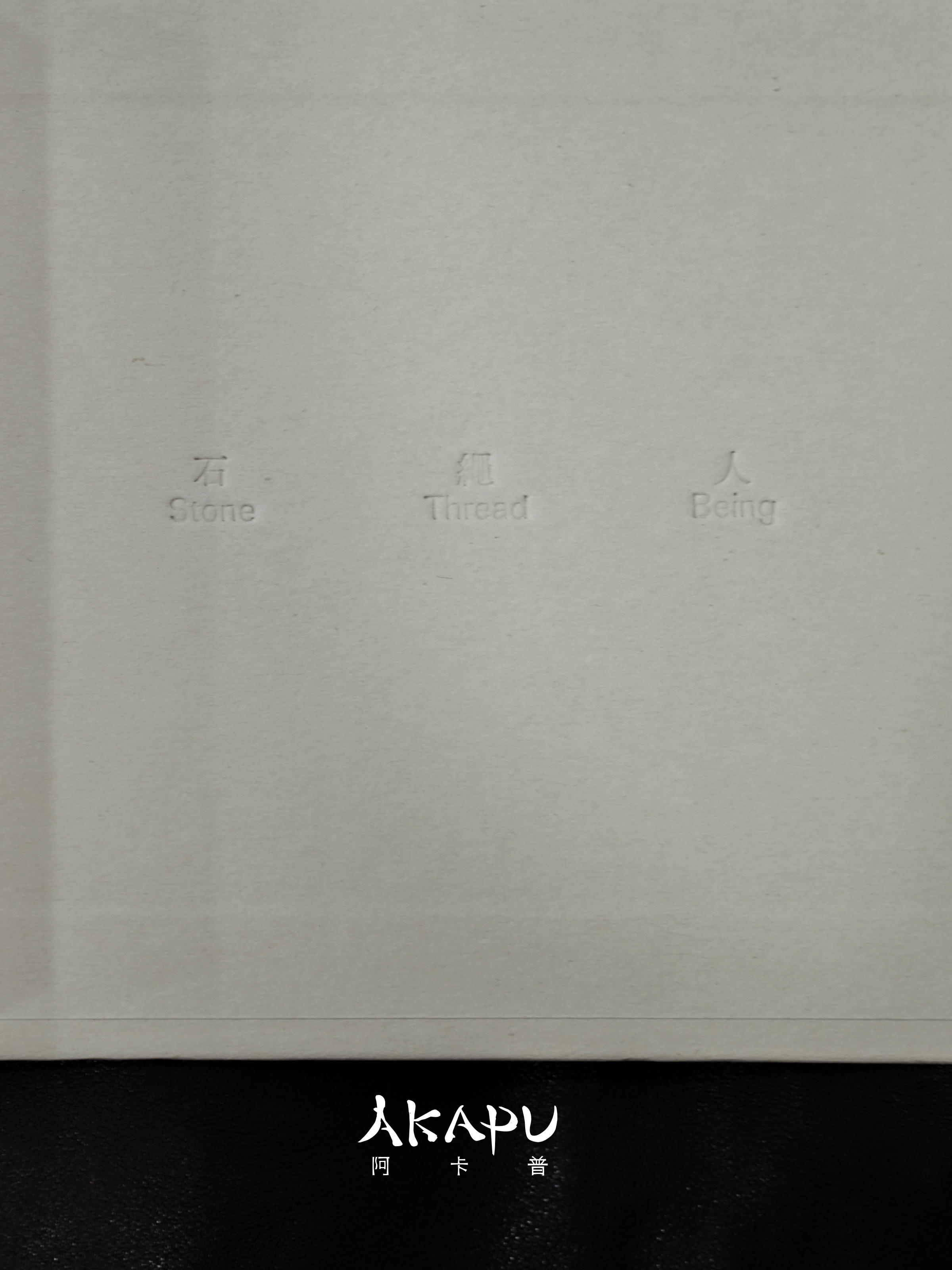
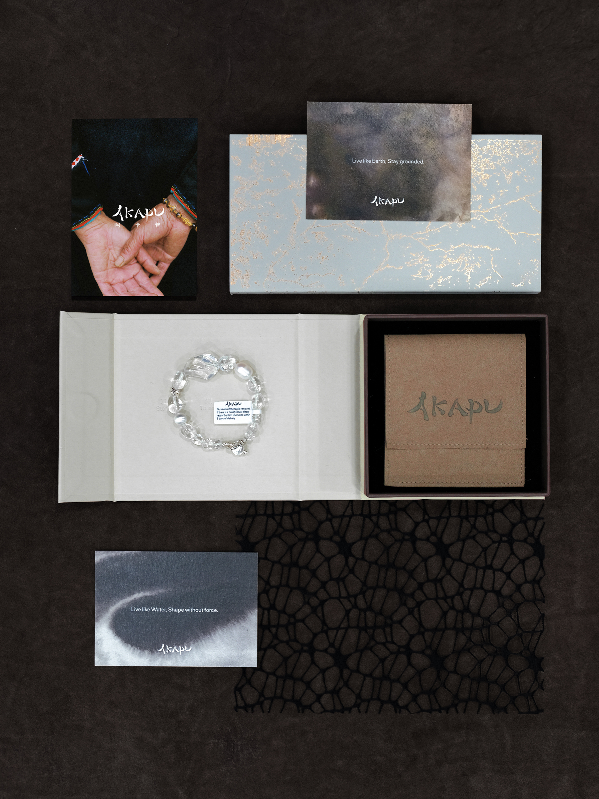
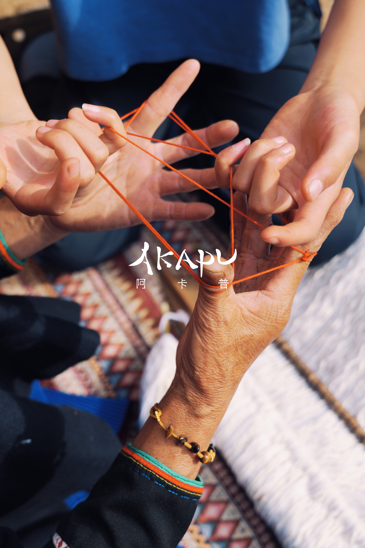
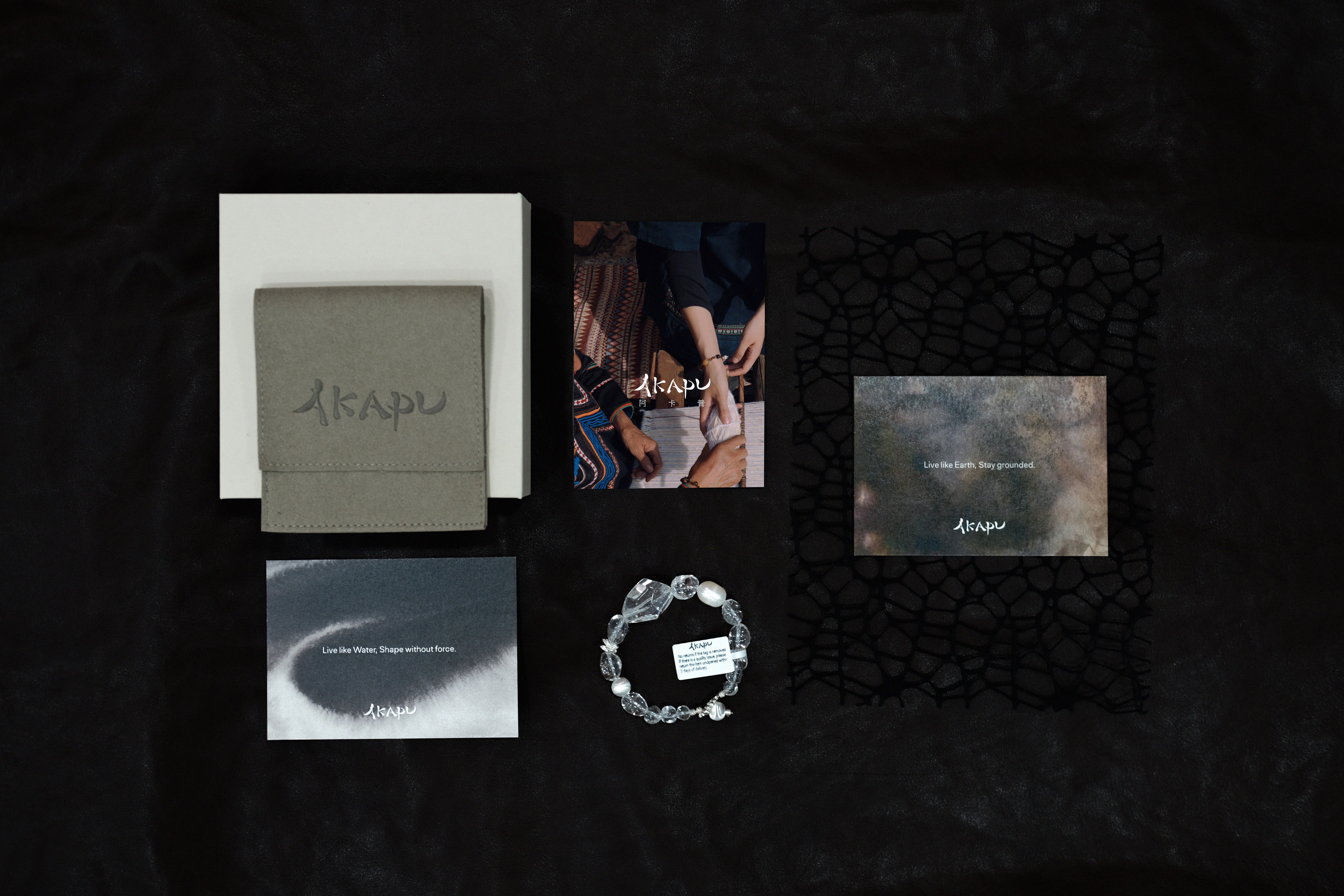
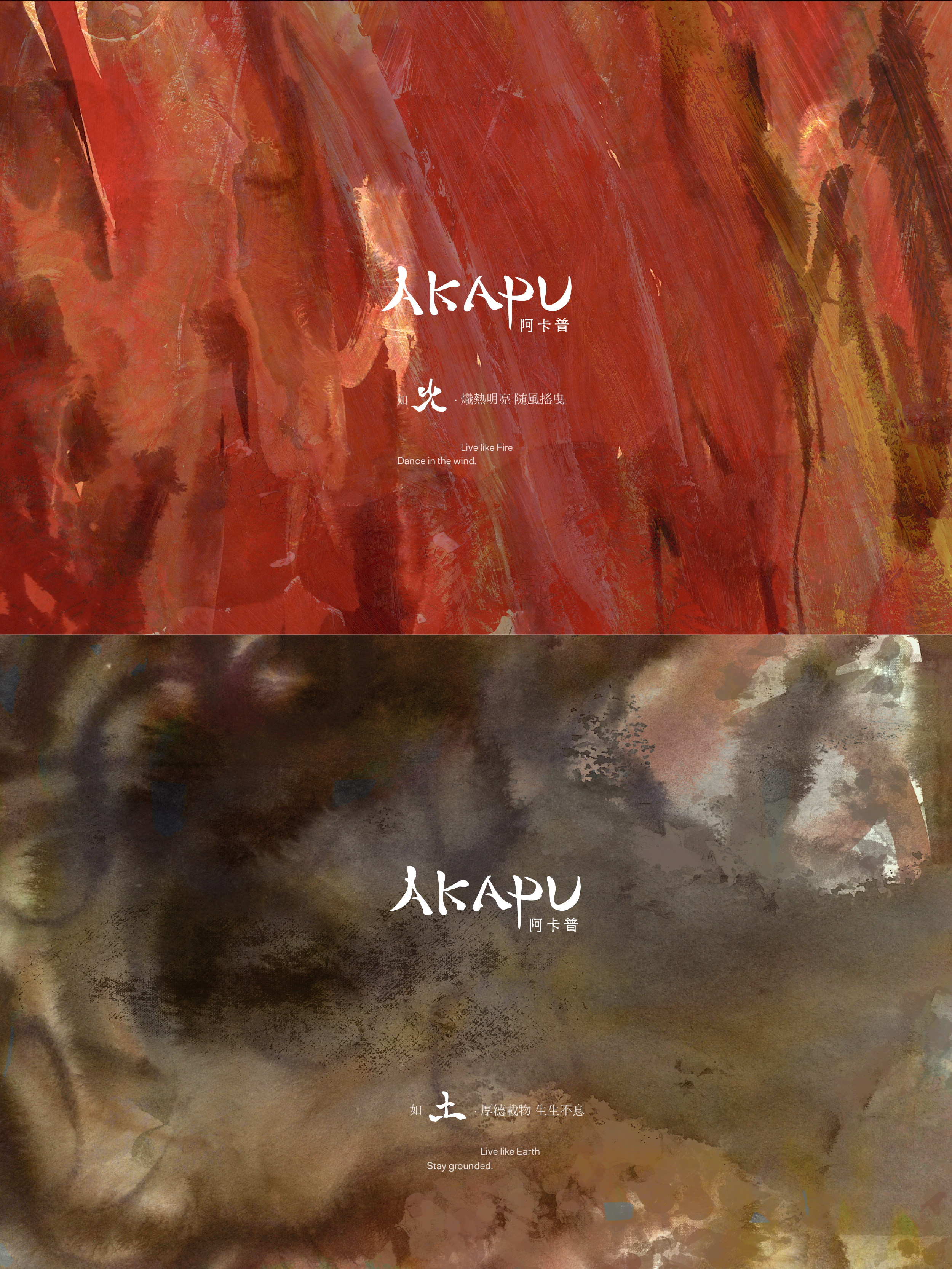
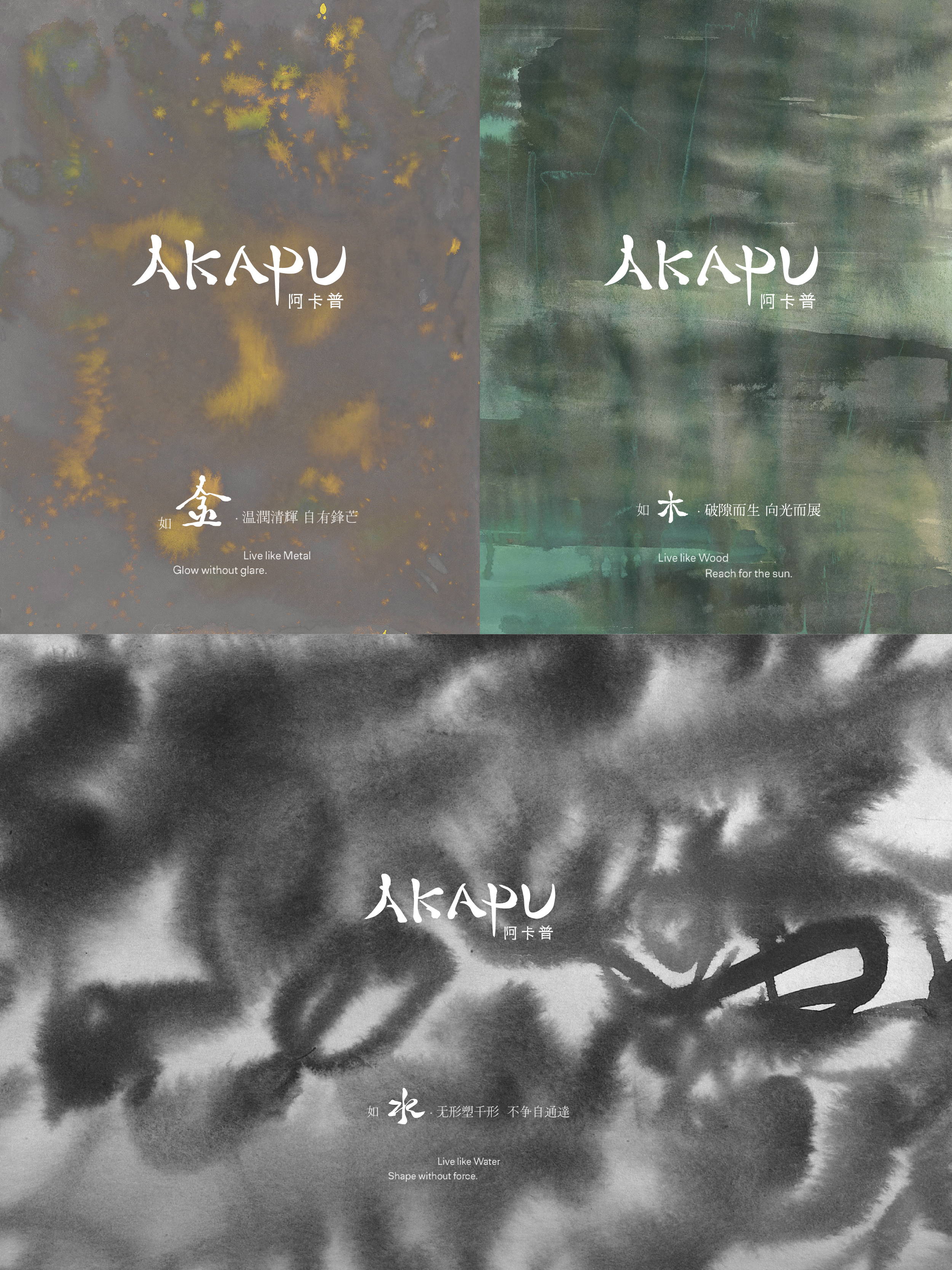
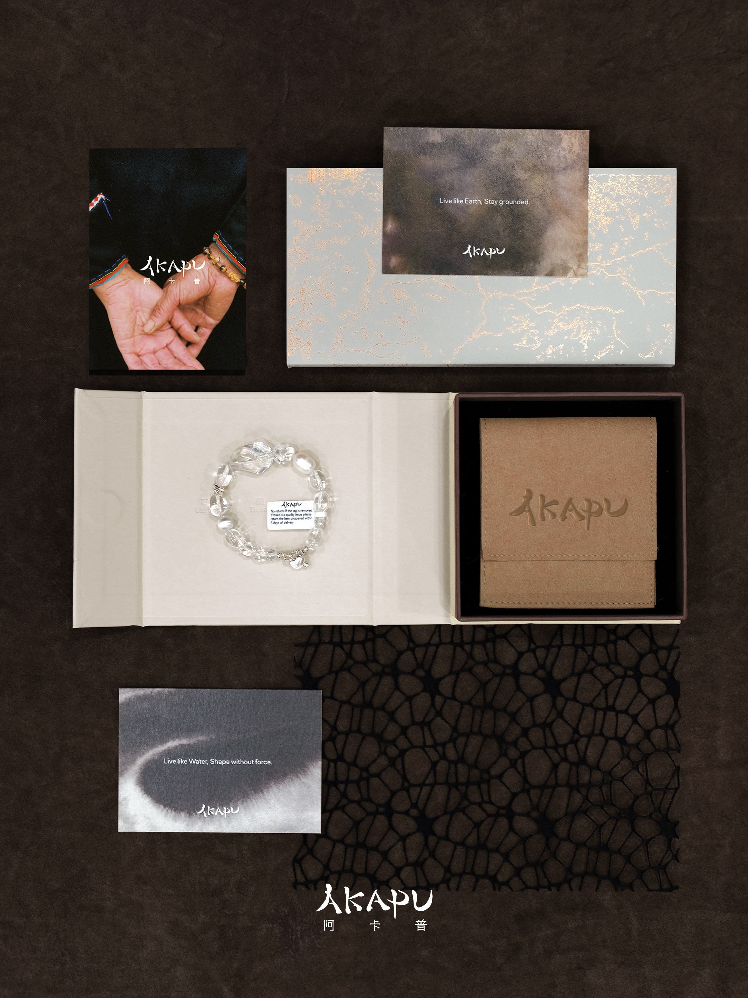
在品牌视觉的构建上,将中式书法的力量融合进入标志图形中,形成英文标志识别;中文字体的笔画由编制藤条的轮廓演化而来,把对手工艺人的尊重编织进品牌设计语言里。同时还创作了五幅绘画,从视觉上传递「五行」之力。
"Akapu," meaning “Flower and I,” is a metaphor for the symbiosis between humanity and nature. By exploring the ancient wisdom of China, the gift of the earth is transformed into a sustainable wearable gesture, awakening the wearer's primal connection with natural energy.
In developing the brand's visual identity, the power of Chinese calligraphy is integrated into the logo, forming the English logo identity. The strokes of the Chinese characters are derived from the contours of woven rattan, weaving respect for artisans into the brand's design. Five artwors were also created to visually convey the power of the 「Wuxing」(the Five Elements from China).
AD: 连连
Creative: Candy
Design & Photography : 连连、 llullzl
